Some Christmas trees try too hard. They stack every trend on a single branch until the whole thing reads like a holiday yard sale. But elegant Christmas tree decorating is something else entirely: it’s about picking a direction and letting the tree breathe. These 20 ideas skip the clutter and go straight for polished, grown-up holiday style.
Whether you lean toward icy white and gold, soft blush and pearl, or deep burgundy and green, each look keeps the tree as the hero and the room around it simple. You will find palettes, materials, and lighting choices that feel luxurious without needing a full renovation. No tinsel avalanches here.
1. Classic White and Gold Christmas Tree Layout
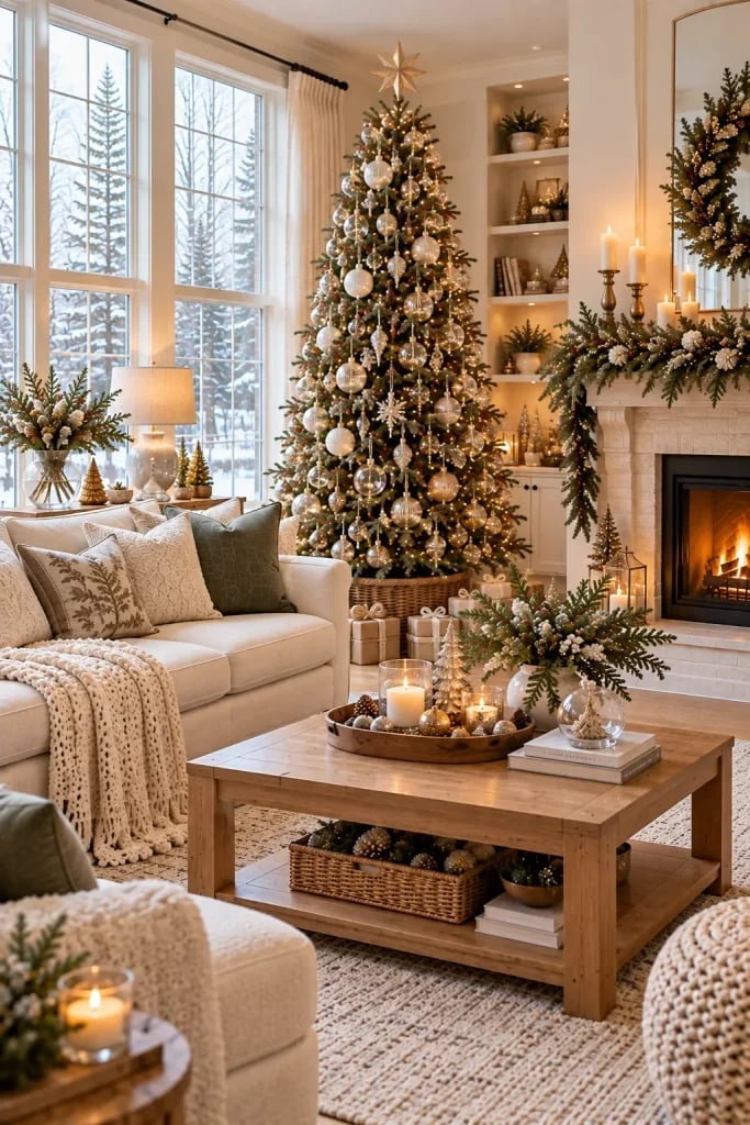
The tree is the center of the room, and the room stays simple around it. That is the oldest trick in the luxury decor book. A white and gold palette softens the traditional green and brown of a real pine, so the glass ornaments and knit tree skirt do not fight each other. The fireplace glow adds warmth without competing for attention. The layout works because the tree owns the space, and the sofa and coffee table frame it without crowding it. The one useful principle here is negative space: leave enough floor between the tree and the furniture so the eye lands on the hero element first.
2. Flocked Christmas Tree Color Palette
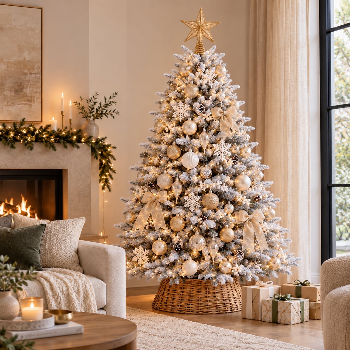
A flocked tree is a palette shortcut because the white coating already unifies everything. Gold ornaments and snowflake shapes stand out against the cream branches, and the woven tree skirt in natural wood tones adds warmth. The fairy lights are warm, not cool, so the white stays soft rather than stark. The palette is two-thirds white and cream, one-third gold, with green only where the flocking wears thin. That ratio defines the look. Adding a third metallic, like silver or copper, splits the eye between competing finishes.
3. Luxury Ornament Materials
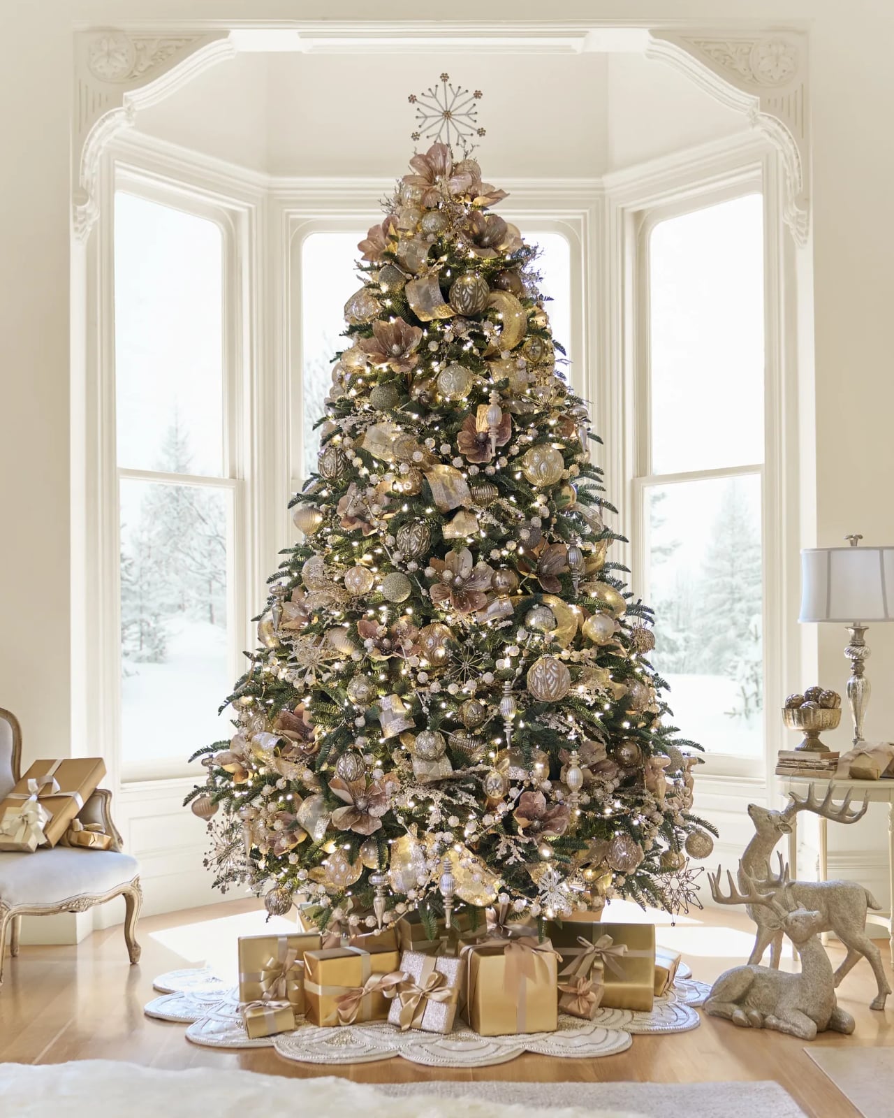
What makes an ornament look expensive when it is close to the eye? The finish. Glass with a real glitter coating catches the string lights differently than painted plastic does. The detail vignette shows gold and silver balls mixed with flocked branches, and the warm ambient light hits the glitter in small bright spots rather than one flat shine. The first paragraph explains the material hierarchy: glass over plastic, glitter over matte, and a mix of finishes over a single one. The second paragraph explains the practical rule. To keep the look cohesive without buying a whole new set, pull the three most reflective ornaments and cluster them near the lights. The rest of the tree reads as uniform from a distance, but the eye finds the sparkle up close.
4. Warm Ambient Lighting for Christmas Tree
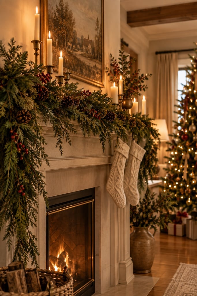
The fireplace garland is the main light source here, not the tree. Pine, berries, and a brass detail catch the glow from the fire and the candles, so the stockings and the tree in the background read as one warm scene. The palette is green and red with white and gold accents, which is traditional, but the warm ambient light softens the red so it does not feel primary. The one useful principle is light layering: the fire gives a low, flickering glow, the candles add mid-height warmth, and the tree lights fill the upper plane. Three levels of light keep the room from falling flat.
5. Fireplace Garland Styling Variation
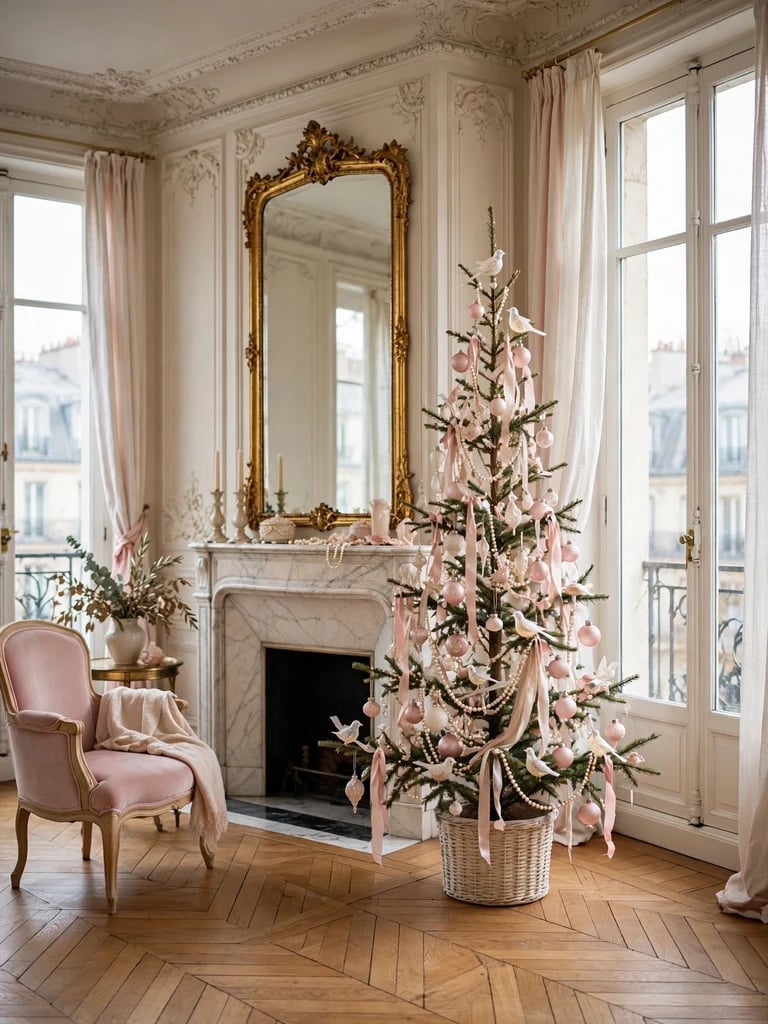
For a pink and pearl tree, keep the base neutral. The real tree here sits in a plain white basket, and the glass ornaments and pearl garlands do the color work. Pink stays soft when it is the only warm note against white and gold, but it can feel sweet if the basket or the ribbon competes. The palette stays 60 percent white, 30 percent pink, and 10 percent gold. Adding red or burgundy shifts the tone from elegant to playful. Natural light helps the pearls catch a subtle shine without needing extra lamps.
6. Parisian Pink and Pearl Tree Style
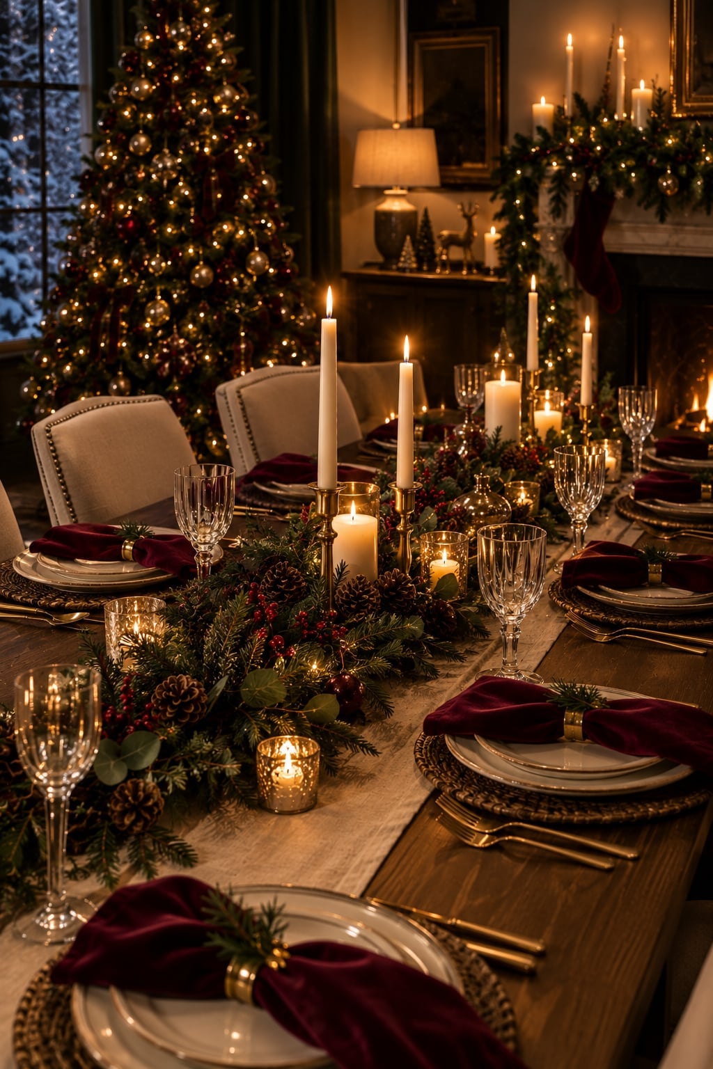
For a dining room that leans traditional, a burgundy and gold palette feels like the natural choice. That is exactly what this room serves up: a candlelit table set for a festive meal, with a lit Christmas tree glowing in the background and a fireplace adding its own warmth. The velvet on the chairs, the gold glass on the table, and the greenery and wood all stay within that classic framework. What breaks the expected here is the creamy candlelight itself. It softens the burgundy so the room feels rich but not formal. If your own dining room feels stuck in one note, swap in a single warm light source. It changes the ratio of the palette without buying a single new ornament.
7. Burgundy and Gold Dining Table Setting
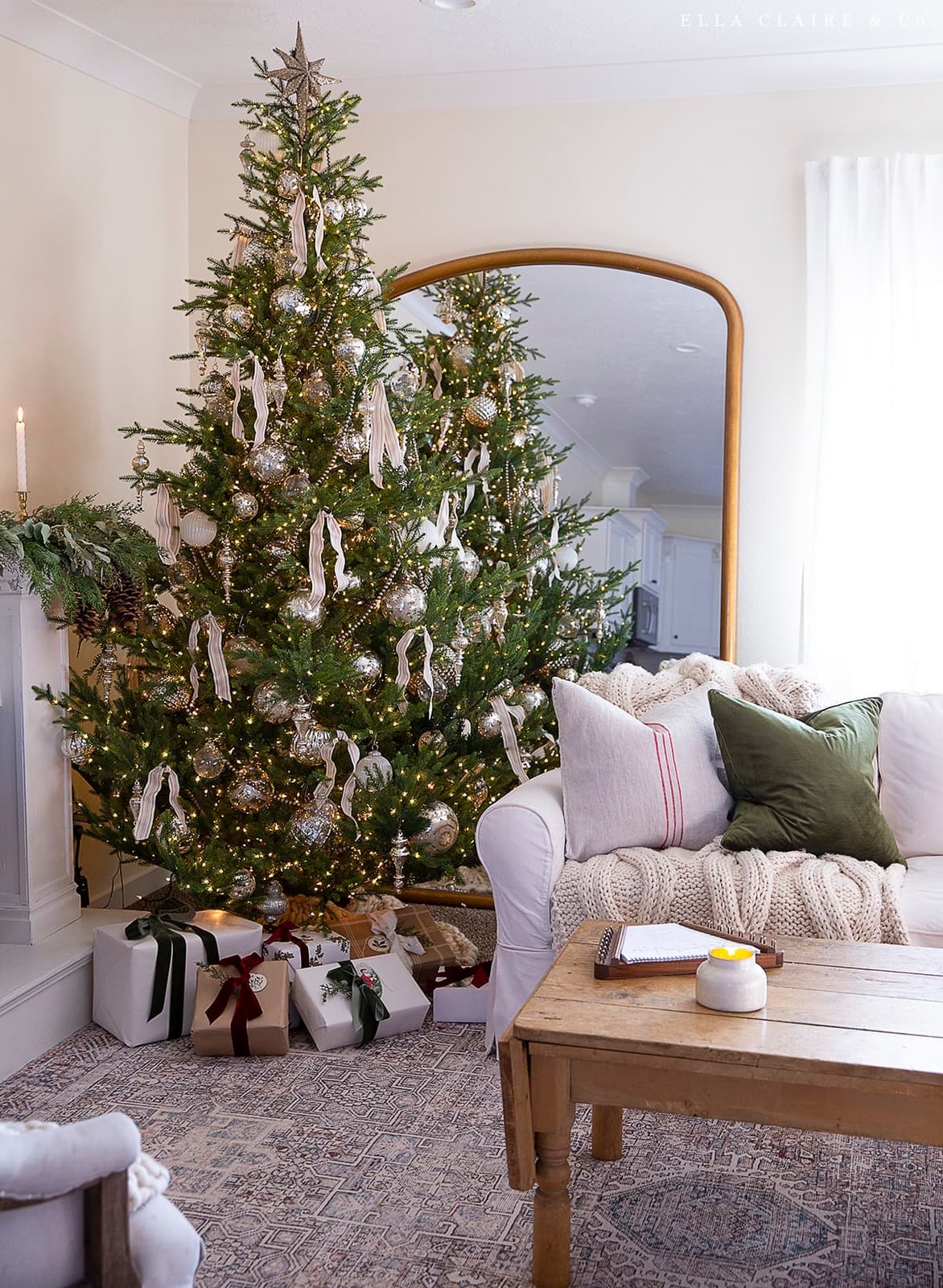
A Christmas tree near the sofa, silver ornaments in natural light, and a cream ribbon woven through the branches. The palette is silver, cream, green, and gold, which keeps the whole space feeling airy. For renters, the trick is that nothing here is permanent. The ribbon comes down in minutes, the ornaments pack into a single box, and the tree itself leaves no mark on the walls or floors. You get a polished look that moves with you.
8. Neutral Luxury Tree Materials
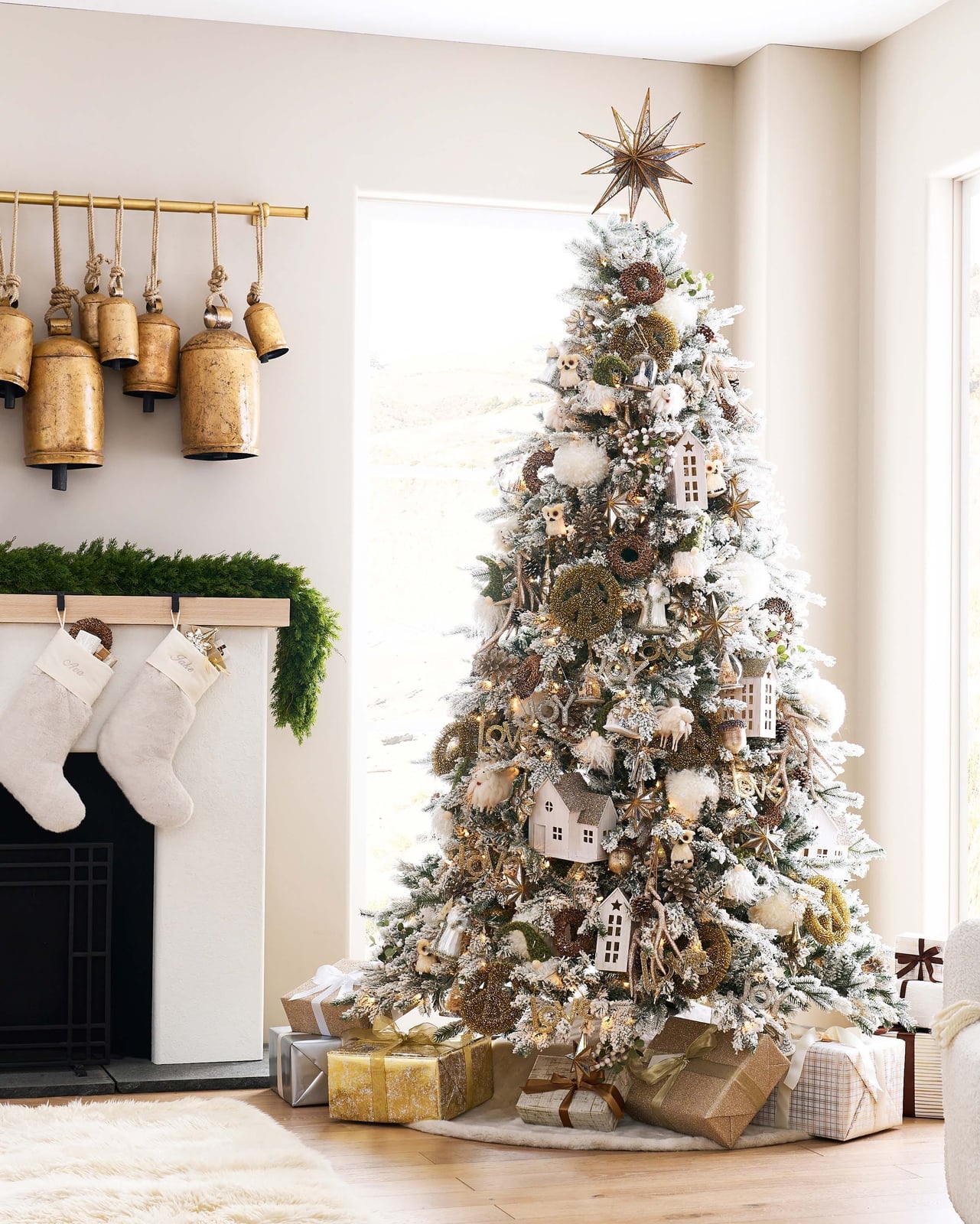
The materials here do the talking. A flocked tree sits next to a fireplace with stockings, and the mix of flocked branches, wood, metal, and natural elements like pine cones and gold bells creates a look that is both rustic and polished. The palette of white, gold, green, and brown keeps the eye moving across different textures. The flocked branches and wood keep the matte base, while the gold bells and metallic accents add just enough reflectivity. If your tree feels flat, check your material balance, not your ornament count.
9. Rustic Luxury Tree Styling
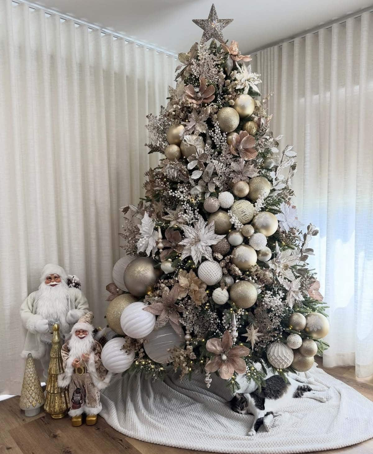
This roomy living room centers a Christmas tree packed with gold, cream, white, and blush baubles so close together that the branches are barely visible. Santa figures and a smaller decorative tree sit to the side, but the main tree holds the attention. Glass and glitter ornaments catch the warm ambient light and fairy lights, while fabric and wood accents ground the sparkle. The key is the density of the baubles. A sparse tree looks minimal; a packed tree looks opulent. For this look, space the ornaments close enough that the tree becomes a single sculptural piece.
10. Gold, Cream, and Blush Ornament Palette
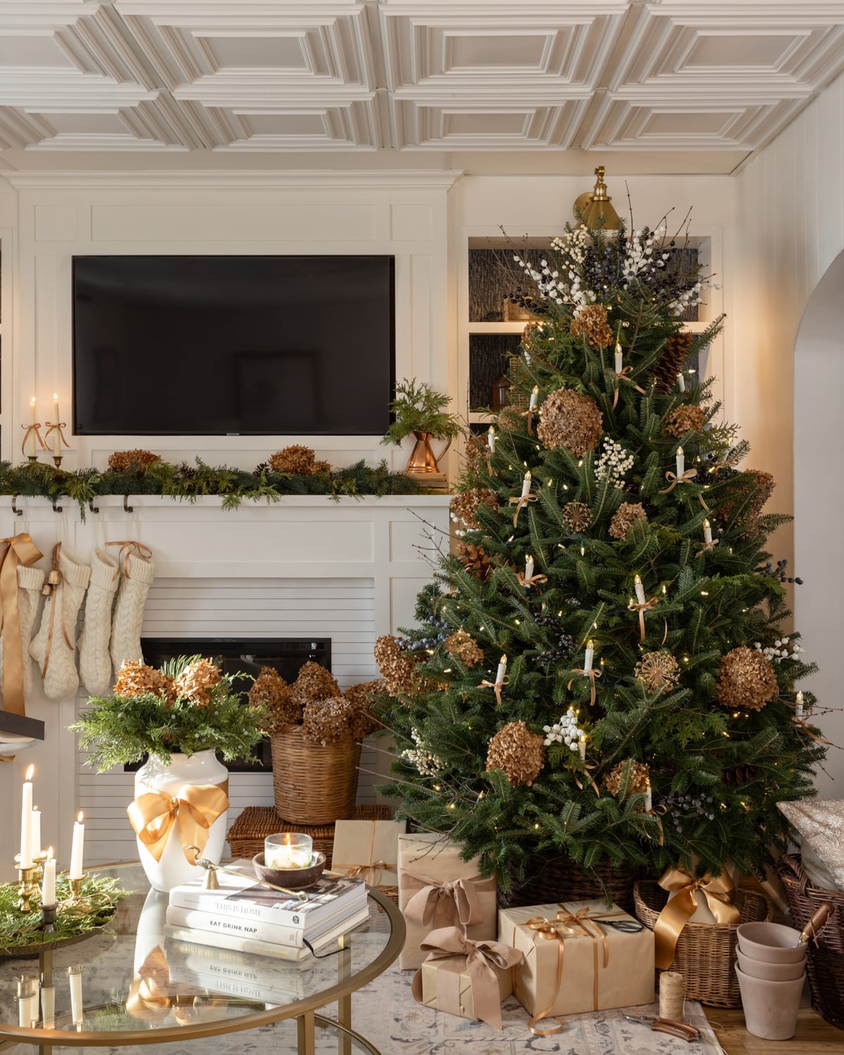
The dried botanicals and pine cones on this tree are not an afterthought. They are the main material story, set against warm ambient light from candles and string lights in a roomy living room. The palette of gold, white, brown, and green comes almost entirely from natural textures: the bark of the pine cones, the dried leaves, the wood of the coffee table nearby. The fireplace adds a second warm light source. What this design proves is that a luxury Christmas tree does not need a single shiny plastic ornament. Natural materials bring their own elegance and cost nothing to replace when the season is over.
11. Elegant Rustic Tree Materials
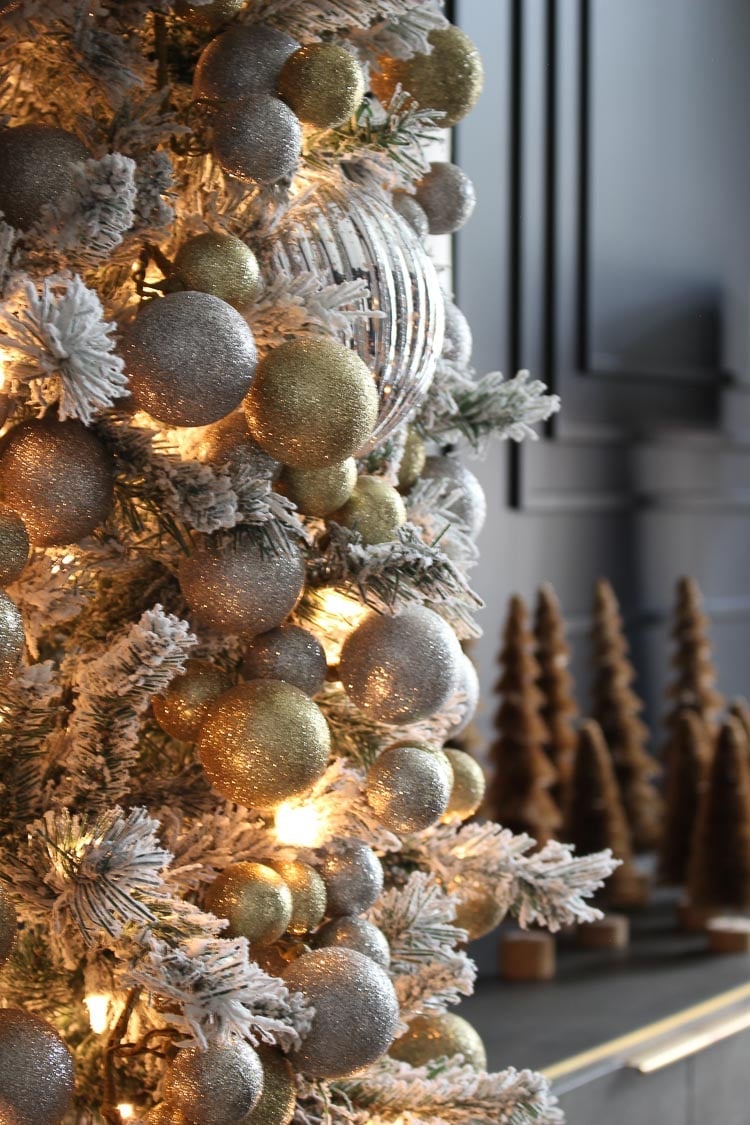
To create a cohesive look with mixed finishes, start with a consistent base and let the accents stand out. A flocked tree offers a soft, muted backdrop for ornaments. Glittered baubles and clear glass spheres hang among the branches, their reflective surfaces contrasting with the matte white needles. Warm string lights woven through the tree add depth without competing. This approach lets you combine shiny and matte elements without the tree feeling busy. The flocking acts as a neutral canvas, so the metallic and glass pieces become the focus rather than getting lost in a sea of green.
12. Sparkling Ornament Detail
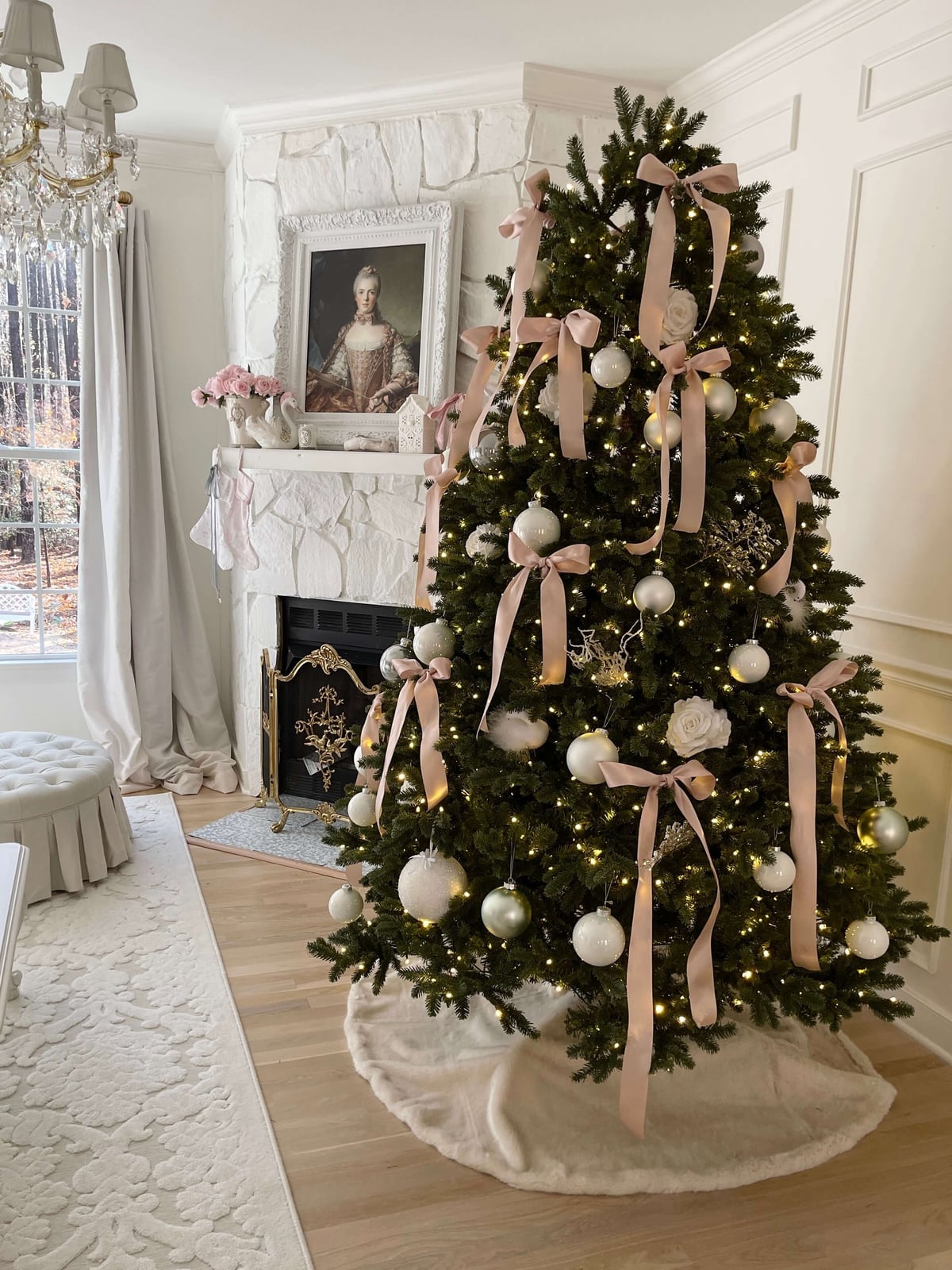
A blush pink velvet ribbon adds a soft, romantic note that still fits a traditional tree. The ribbon is woven through the branches in loose loops, with the tails left to drape naturally. White and silver ornaments hang nearby, their cool tones balancing the warmth of the pink. The tree sits in front of a fireplace, and the warm string lights cast a gentle glow across the velvet, picking up its texture.
What makes this palette work is the ratio. Blush pink appears in the ribbon alone, while white and silver ornaments fill the tree. That one-to-three ratio keeps the pink from taking over. The green of the pine branches grounds everything, so the blush reads as an accent. If you want to try this look, stick to one colored ribbon and let the ornaments stay neutral.
13. Blush Pink Velvet Ribbon Accent
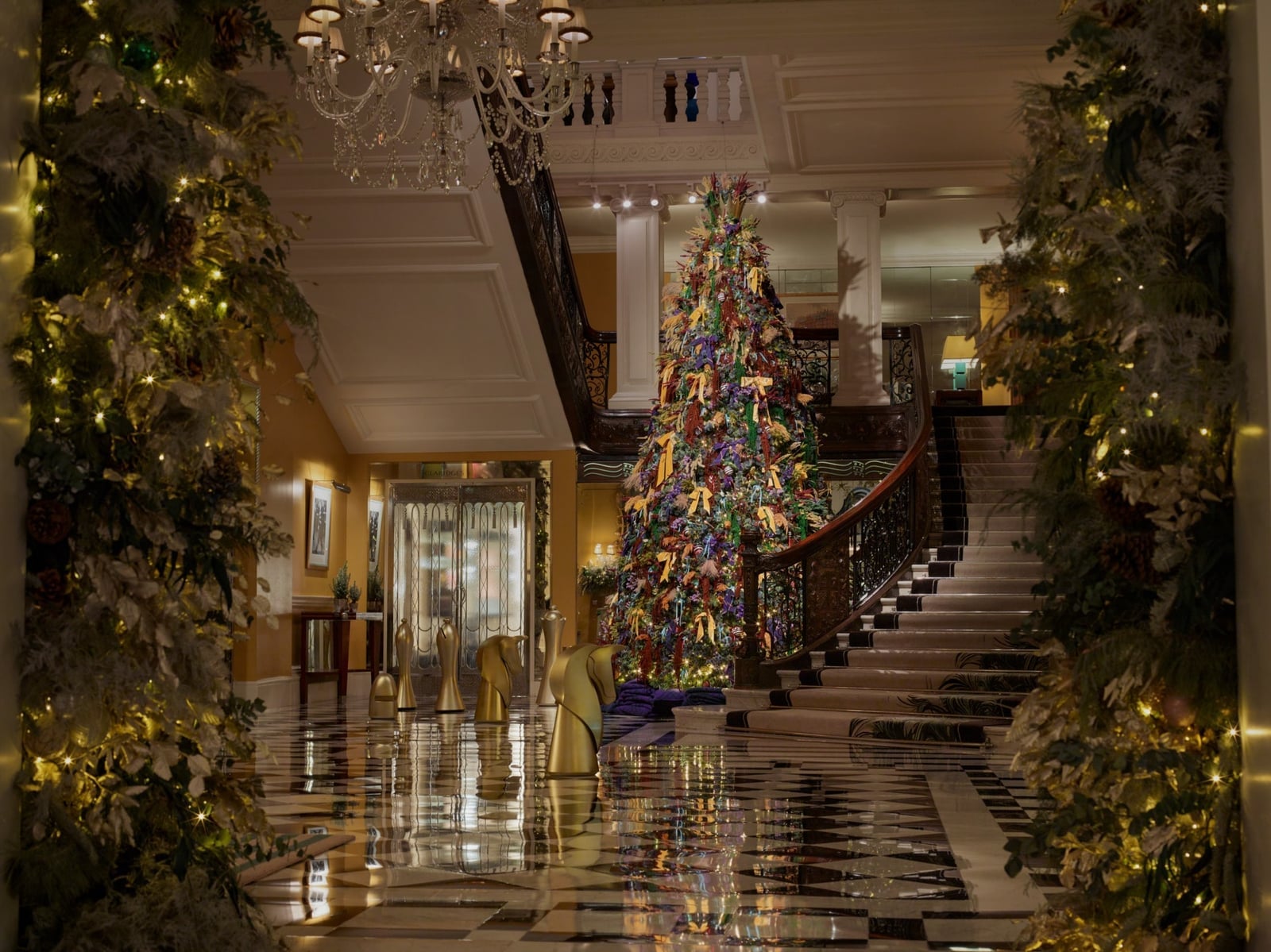
A large tree in a foyer with a grand staircase and chandelier calls for ornaments that hold their own against the scale. Glass baubles in gold and deep red hang alongside matte metal pieces, their glossy surfaces catching the ambient light from the chandelier and the warm string lights woven through the branches. The mix of finishes keeps the tree from looking flat. The greenery itself is dense and full, filling the vertical space without gaps. For a room this size, the ribbon acts as a visual anchor, drawing the eye across the full height of the tree rather than letting it settle on one spot.
14. Grand Foyer Tree Layout
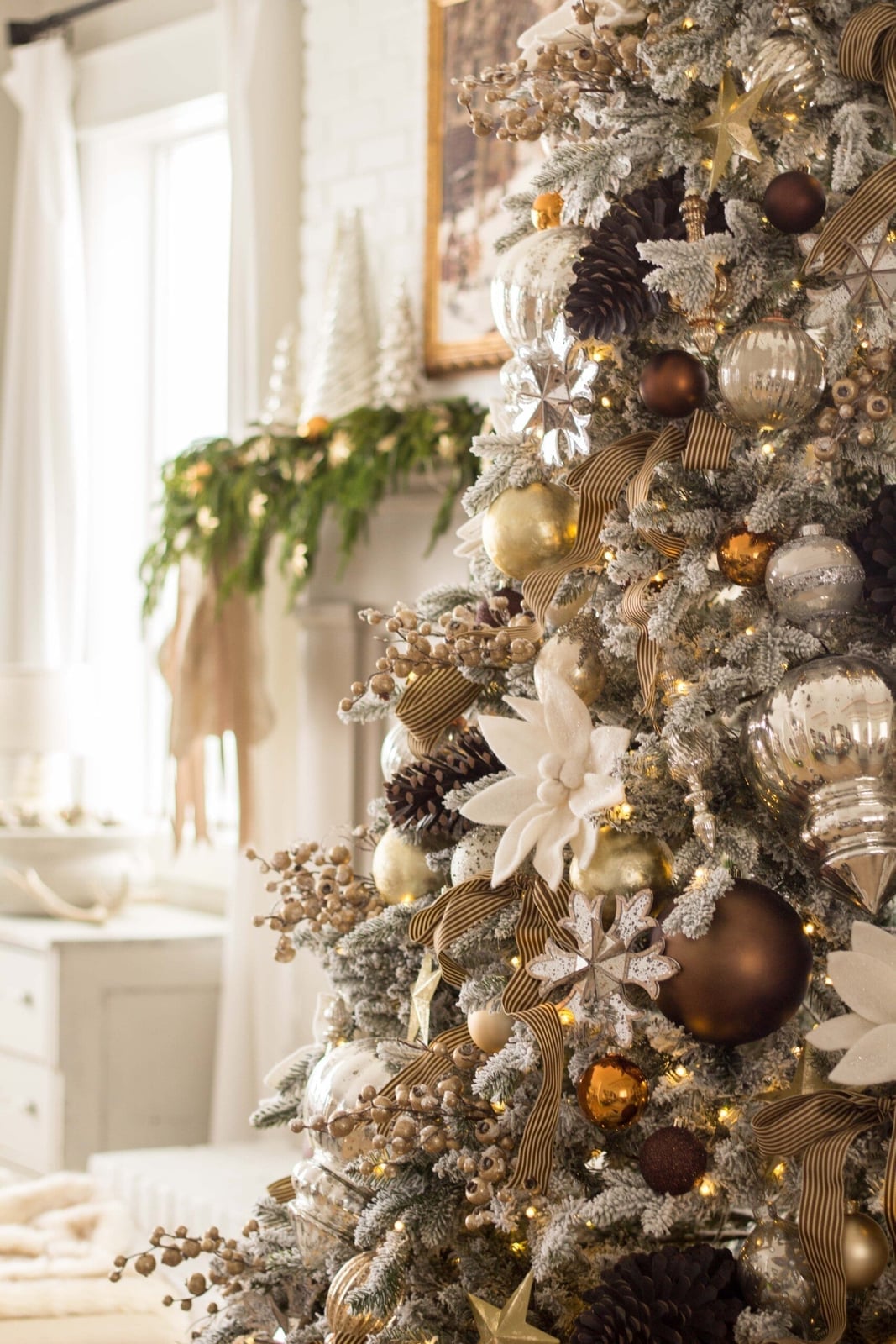
A flocked tree with pine cones and gold ornaments is a straightforward way to bring natural texture into a luxury setting. The flocking softens the silhouette of the branches, while the pine cones add an organic element that contrasts with the polished metallic ornaments. Gold ribbon is threaded through the tree in a spiral, its sheen picking up the warm string lights. The tree itself is positioned so the fireplace is visible nearby, which gives the whole scene a cohesive feel. If you are working with a flocked tree, keep the ornaments in a narrow range of finishes. Gold and cream stay within the same family, so the pine cones do not look out of place.
15. Flocked Tree Natural Elements
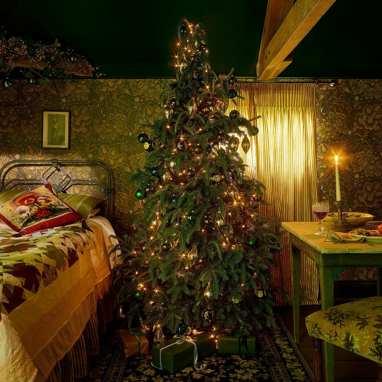
How do you keep a traditional green and gold tree from feeling dated? The trick is in the ratio of green ornaments to gold accents. Here, the tree is filled with green glass baubles in varying sizes, with gold pieces spaced evenly throughout. The green ornaments echo the color of the tree itself, so the gold stands out without overwhelming the branches. Warm string lights add a soft glow that keeps the palette from feeling flat.
This setup works well in a compact space, like a corner of a bedroom. The tree itself is full but not oversized, and the green and gold palette keeps it from competing with the rest of the room. A small table nearby holds a lamp and a few books, which adds a lived-in feel. For storage, pack the green and gold ornaments in separate boxes so you can adjust the ratio next year without sorting through everything again.
16. Traditional Green and Gold Palette
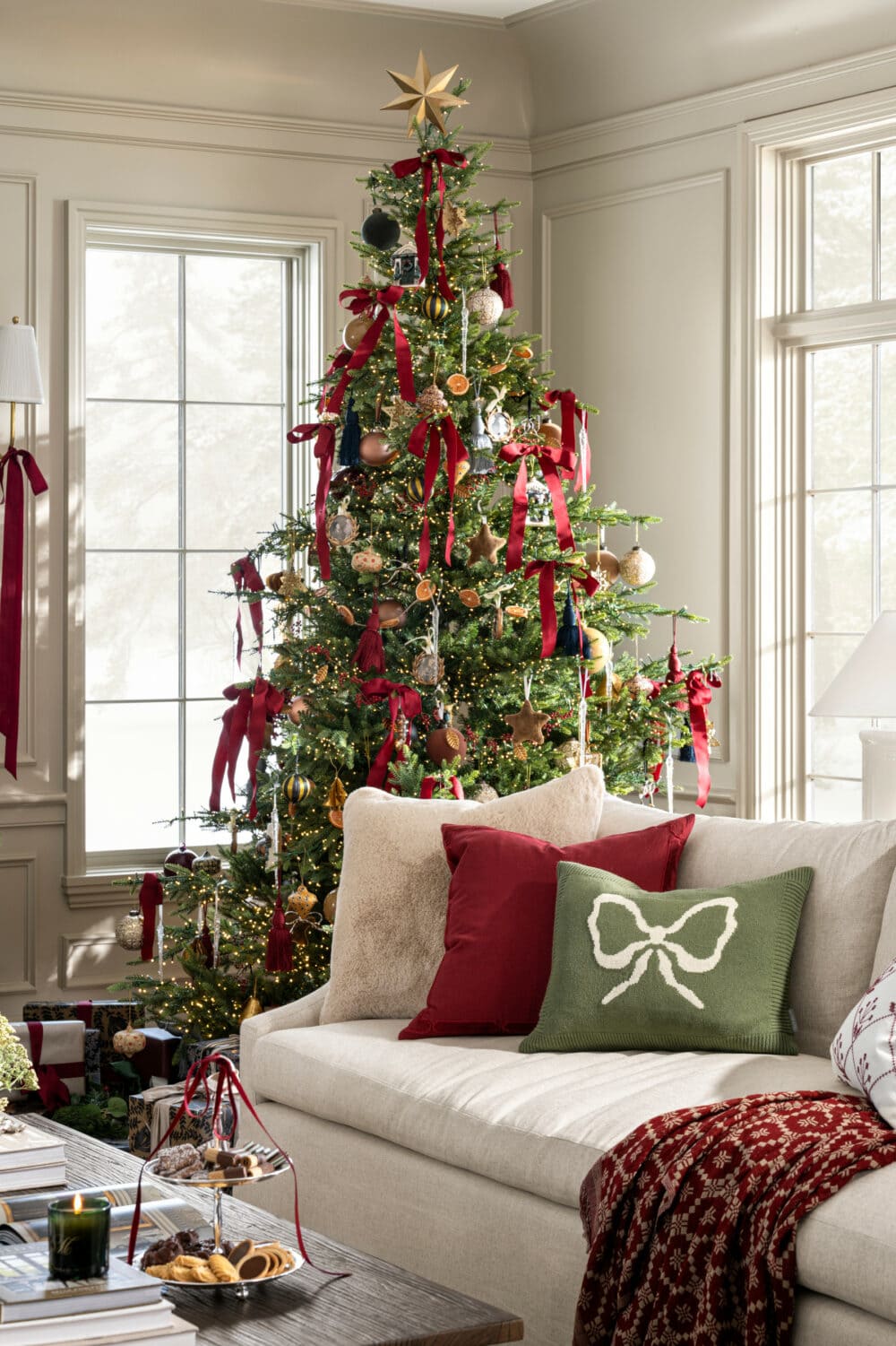
A traditional palette of green, red, gold, and beige keeps the tree feeling grounded, not glitzy. The red ribbon woven through the pine branches echoes the same red in the patterned pillows on the linen sofa nearby. Warm string lights soften the contrast, so the gold ornaments act as accent, not the main event. The layout pairs the tree with the sofa, which makes the whole room feel balanced. Keep the red and gold ratio close to three to one. Too much gold tips it into gaudy, too much red loses the elegance.
17. Red Ribbon Styling Variation
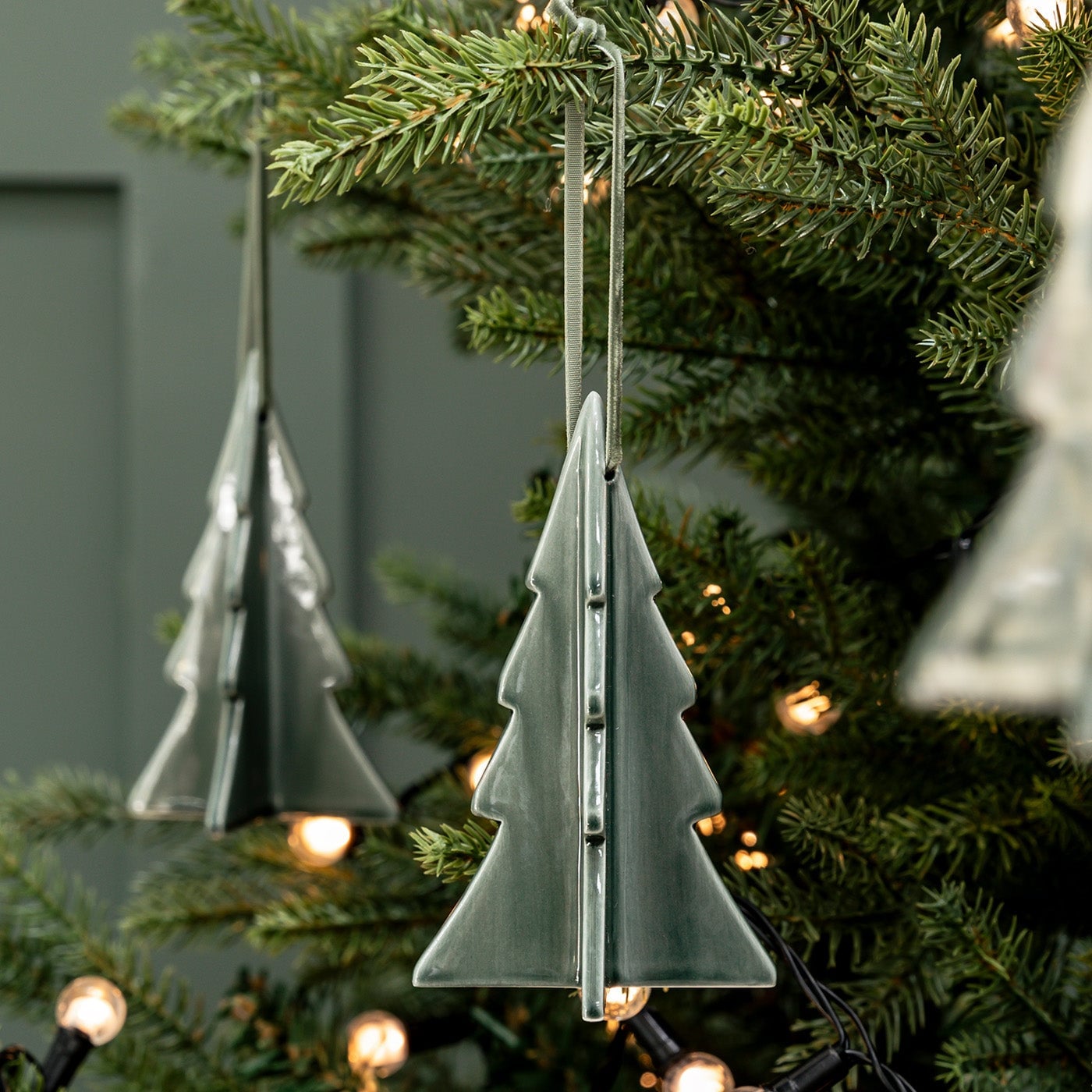
Let the shape of the ornament be the decoration. Geometric tree-shaped ornaments in ceramic and glass hang against a grey-green palette with no extra fillers. The soft ambient light catches the matte finish, not a gloss, which keeps the look quiet. The ratio of empty branch to ornament is about two to one. Adding ribbon, tinsel, or any curved shape breaks it. This is a renter-friendly swap because it works with a standard pre-lit tree and needs no permanent hooks or wiring. Just the ornaments, spaced wide, and the tree itself.
18. Minimalist Ornament Materials
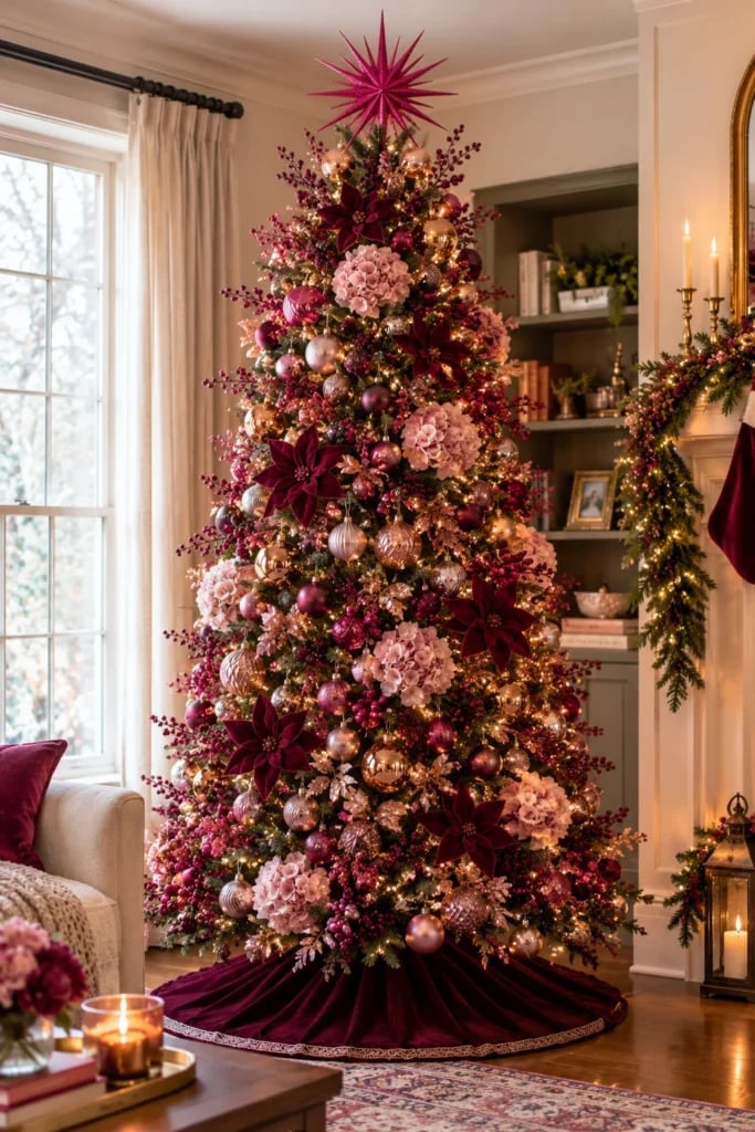
A luxury tree does not have to mean more ornaments. This one leans on texture contrast: velvet ribbon against glass balls, berries tucked into greenery, all in burgundy, pink, and gold. The warm string lights sit behind the layers, so the glow comes through the branches rather than bouncing off the front. The fireplace garland to the right picks up the same berry and greenery mix, which ties the whole living room together without repeating the exact ornaments. A fireplace garland works best when its materials mirror the tree, but its scale stays smaller, about half the fullness, so the tree remains the hero.
19. Burgundy Poinsettia Luxury Accents
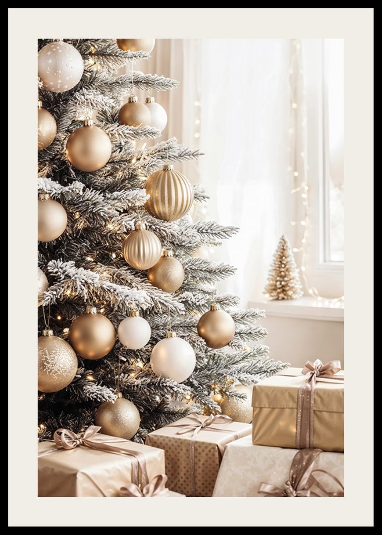
A flocked tree in white, gold, and cream reads as clean luxury, but the real trick is in the gift wrap. The paper gift wrap at the base matches the gold and cream palette, so the pile of presents becomes part of the composition, not a clutter zone. The warm fairy lights are woven deep into the branches, not just on the surface, which gives the flocked tree an even glow. A palette like this holds together when every visible material stays within the three colors: white flocking, cream ribbon, gold glass. Any fourth color, even silver, breaks the cohesion.
20. Luxurious Flocked Tree Presentation
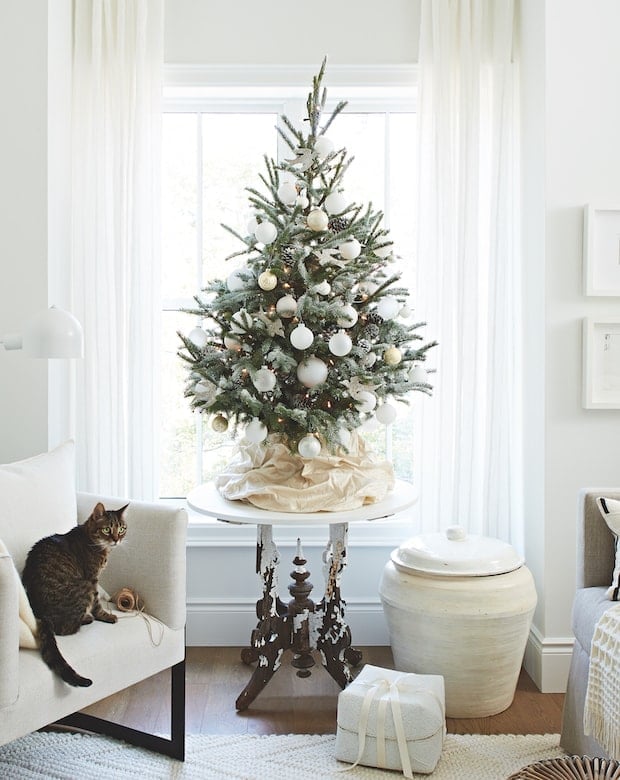
A flocked Christmas tree in white and gold needs space to breathe, and this room gives it that. The tree sits centered with furniture arranged around it, not pushed into a corner. Natural light from the window hits the white flocking, which makes the tree look fuller than it is. The armchair and side table frame the tree without crowding it. A good rule for scale and proportion: the tree should take up about a third of the visual width of the room from the main seating view. Any smaller and it feels like a tabletop tree, any larger and it overwhelms the furniture.
21. Final Thoughts
An elegant tree does not need a lot of extras. Stick to a tight palette, choose quality ornaments, and let the tree stand out. Keep the base simple and the lighting warm. Check your USDA zone before adding live greenery. With these 20 approaches, you can create a tree that feels intentional and luxurious every year.